G oog le BadWeB | Login/out | Topics | Search | Custodians | Register | Edit Profile


Buell Motorcycle Forum » Quick Board » Archives » In honor of Gordon Buhle « Previous Next »

  Thread Last Poster Posts Pages Last Post
Archive through May 15, 2006Jerry_haughton30 05-15-06  09:12 am
Archive through August 29, 2005Sparropie30 08-29-05  02:08 pm
Archive through August 18, 2005Blake30 08-18-05  04:27 pm
Archive through August 13, 2005Oldog30 08-13-05  11:54 pm
Archive through August 11, 2005Pdxs3t30 08-11-05  07:22 pm
         

Author Message
Top of pagePrevious messageNext messageBottom of page Link to this message

Oldog
Posted on Monday, May 15, 2006 - 12:12 pm:   Edit Post Delete Post View Post/Check IP Print Post    Move Post (Custodian/Admin Only)

after reading through the thread,

I think the "loan wolf" was Team?

Jerry that paver is great, would it be

appropriate to use that design for the

patch you all are discussing?

It seems fitting statement about this diversion that we all enjoy so much.
Top of pagePrevious messageNext messageBottom of page Link to this message

Jerry_haughton
Posted on Monday, May 15, 2006 - 01:10 pm:   Edit Post Delete Post View Post/Check IP Print Post    Move Post (Custodian/Admin Only)

Jerry that paver is great, would it be appropriate to use that design for the patch you all are discussing?

agreed Oldog, the paver design turned out great. props to Vik (Eeeeek) for taking all the design input and creating such a cool result.

re: the patches, there's been a lot of talk, but nothing has "taken." i think the paver design carried over to a patch would be great.

for the patches to come to fruition, we need someone to run with the idea and see it to completion. my workload these days is such that i'm not the person for the job, however.

FB
Top of pagePrevious messageNext messageBottom of page Link to this message

Oldog
Posted on Tuesday, May 16, 2006 - 12:03 am:   Edit Post Delete Post View Post/Check IP Print Post    Move Post (Custodian/Admin Only)

I can sketch a little here on the box,

What do you think about this?


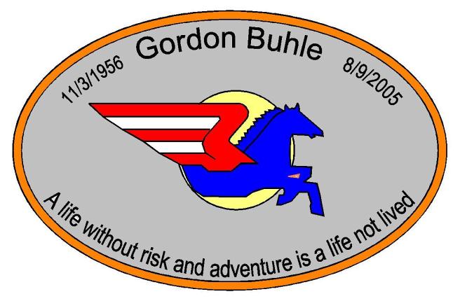
the logo I traced came from the team elves site, it was on a black background,
I placed it on grey and colored the background of the logo in a light gold
as if the pegasus were flying into the light (sun) I changed it only enough to make an oval patch of it

Jerry I hope that you folks like this

Jim.....
Top of pagePrevious messageNext messageBottom of page Link to this message

Eeeeek
Posted on Tuesday, May 16, 2006 - 01:38 am:   Edit Post Delete Post View Post/Check IP Print Post    Move Post (Custodian/Admin Only)

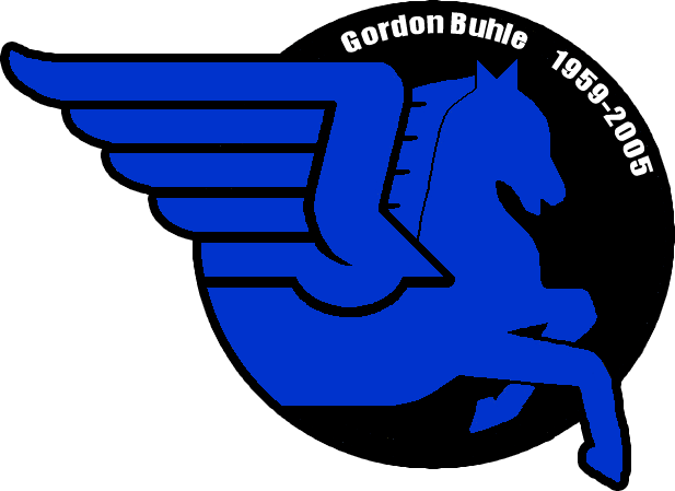
I made this at the same time as the Paver design:


patch


Vik
Top of pagePrevious messageNext messageBottom of page Link to this message

Eeeeek
Posted on Tuesday, May 16, 2006 - 07:47 pm:   Edit Post Delete Post View Post/Check IP Print Post    Move Post (Custodian/Admin Only)

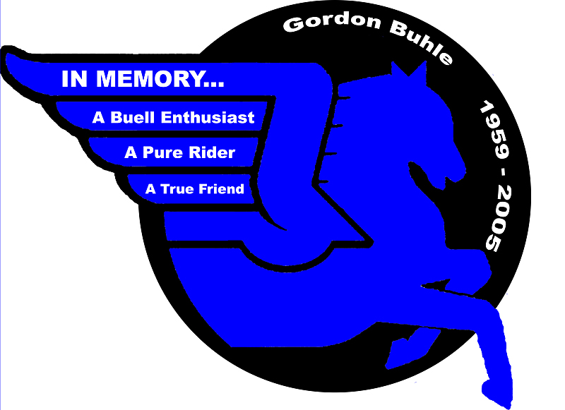
OK, played around a little today. Thoughts?


patch


Vik
Top of pagePrevious messageNext messageBottom of page Link to this message

Jon
Posted on Wednesday, May 17, 2006 - 02:38 am:   Edit Post Delete Post View Post/Check IP Print Post    Move Post (Custodian/Admin Only)

Vik,

I like the first one better. Simpler. A space is needed between "adventure" and "is" on the second patch.
Top of pagePrevious messageNext messageBottom of page Link to this message

Oldog
Posted on Wednesday, May 17, 2006 - 11:25 am:   Edit Post Delete Post View Post/Check IP Print Post    Move Post (Custodian/Admin Only)

Second one
looks real good, and yeah a space is needed as above
Top of pagePrevious messageNext messageBottom of page Link to this message

Jerry_haughton
Posted on Wednesday, May 17, 2006 - 12:12 pm:   Edit Post Delete Post View Post/Check IP Print Post    Move Post (Custodian/Admin Only)

this is a design that my son Wade has been working on, with an assist from Pdxs3t/Jim Corso:

1

FB
Top of pagePrevious messageNext messageBottom of page Link to this message

Jon
Posted on Wednesday, May 17, 2006 - 02:26 pm:   Edit Post Delete Post View Post/Check IP Print Post    Move Post (Custodian/Admin Only)

The small font stuff on the second patch will be hard to do I think. IMHO.

Very nice job everyone...still like Vik's No. 1
Top of pagePrevious messageNext messageBottom of page Link to this message

Eeeeek
Posted on Wednesday, May 17, 2006 - 09:00 pm:   Edit Post Delete Post View Post/Check IP Print Post    Move Post (Custodian/Admin Only)

Playing off of Wade's idea:


altpatch


Vik
Top of pagePrevious messageNext messageBottom of page Link to this message

Eeeeek
Posted on Wednesday, May 17, 2006 - 09:03 pm:   Edit Post Delete Post View Post/Check IP Print Post    Move Post (Custodian/Admin Only)

Hmm...maybe move the text a little...


moved


Vik
Top of pagePrevious messageNext messageBottom of page Link to this message

Firemanjim
Posted on Wednesday, May 17, 2006 - 09:51 pm:   Edit Post Delete Post View Post/Check IP Print Post    Move Post (Custodian/Admin Only)

Put "Gordon Buhle" on top and the dates on bottom.
Top of pagePrevious messageNext messageBottom of page Link to this message

Jon
Posted on Wednesday, May 17, 2006 - 10:28 pm:   Edit Post Delete Post View Post/Check IP Print Post    Move Post (Custodian/Admin Only)

Remembering the patch will have a border, there would need to be an adjustment made to make the dates fit down there.

How big would this patch be? That would drive the readability of Gordon's name.
« Previous Next »

Add Your Message Here
Post:
Bold text Italics Underline Create a hyperlink Insert a clipart image

Username: Posting Information:
This is a private posting area. Only registered users and custodians may post messages here.
Password:
Options: Post as "Anonymous" (Valid reason required. Abusers will be exposed. If unsure, ask.)
Enable HTML code in message
Automatically activate URLs in message
Action:

Topics | Last Day | Tree View | Search | User List | Help/Instructions | Rules | Program Credits Administration