| Author | Message | ||
Jerseyguy |
I had a graphic artist draw up my idea of a logo for our informal group. She did exactly what I said but I'm still not feelin' it 100%. Any cool ideas? I've got another one coming that's somewhat similar where the road is a dragon's body with the head glaring back at the rider. 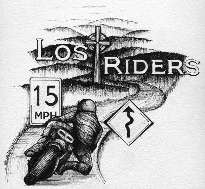 | ||
Buellinachinashop |
I'd 86 the signs unless the artist can/will make them look like actual signs. If it were me, I'd get rid of the speed limit one for sure. I'd also make the bike more Buell, if the club is Buell. | ||
Ducxl |
Say,that's a Ducati in that logo. It isn't for a Badweb group in the stormfronts section? Replace the speed limit sign with one of those "Dangerous curves ahead" signs | ||
Buellrider11960 |
like the cross ; lose the signs | ||
Ferrisbuellersdayoff |
*Change bike to a Buell *Lose the cross unless you are going for the Christian denomination only. If this is in respect to deceased riders I'd lose the Crucifix. Instead use of a head stone on the top of one of those hills would be better. *Lose the 15MPH sign *Put a sign post under the curvy road sign. | ||
Jerseyguy |
Ducxl - You are correct. It was the best rear cornering photo I could find online. It's supposed to be generic but I guess the exhaust gives it away. It's not easy to capture the essence of cornering but I think she did a good job on that. The men in the group have multiple bikes of multiple brands. I agree that the signs aren't quite right but the foreground needs something and they kind of get the message across. 15 MPH turns are my favorite so that's where that came from. More opinions please. | ||
Swordsman |
This is just my personal opinion, but being an artist myself, I can't help but feel that's rather "complex" for a logo. The most successful logos tend to be much simpler shapes, not entire detailed landscapes. I would ditch everything but the text itself, keeping the cross as the "T". Maybe make the circle behind the cross a bike wheel, to make clear you're not a bunch of misplaced fox hunters.  ~SM | ||
Buellinachinashop |
I keep looking at the rider and he seems to be wearing a snowmobile suit or something, he looks odd. Swordsman is right on, the more complex the drawing the less "logo" you have. Simplify it more. | ||
Jerseyguy |
This is really for a t shirt and not a logo per se. A poor choice of words for me. This is the picture she used for the rider. 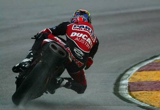 | ||
Oldog |
loose the 15 mph sign use a buell if available looks good, like the cross and its not a crucifix as the body of christ is not on it. | ||
Bads1 |
The rider doesn't look Lost to me. Looks like he's heading in the right direction if you ask me | ||
Beachbuell |
I agree..... Lose the signs, make it a Buell and send me a decal or two! Other than that I like the concept! | ||
Jerseyguy |
Dana - We are always lost! We just follow the best roads and then try to figure out how to get home later. I need a Zumo.... Thanks for all the good comments. I'm going to work most of them into take 2. The riders suit & helmet needs something geometrical on it to make it resemble leathers. The 15 mph sign goes. The tail of the bike should have a Buell like tail with small signals and license plate (2 FAST). | ||
Ferrisbuellersdayoff |
WHOE WHOA WHOA HOLD THE PHONE! Way back in ancient time the Crucifix wasn't made for just Jesus Christ and him alone. It was a form of punishment and torture for an poor bastard that got nailed up there. Jesus just happened to have a large following of people who noticed he was up there. (Enter deciples stage left) Example: JimBob and his buddies were hanging out, and JB says "Forget polytheism!" And BAM! his arse is on a crucifix for heresy. His buddies then disowned the memory of JB because association to a heretic was punishable by death as well. Their arse stayed clear of anything related to JB because they were selfish bastards who wanted to save their arses. The Deciples of Jesus... Not-so-selfish. Granted jesus got nailed up there, and is the most famous crucifix victim. Therefore as some sick and twisted clergy decided to use the symbol of this barbaric device as their LOGO! I mean what if texas used an electric chair as the logo for their churches? Kinda sickening huh? Can you just imagine going inside and above the altar is a figgeting, vibrating and flashing dummy in a wooden chair with smoke machines pumping out little clouds every so often. or maybe just the chair. And gold plate it to make it official. How do you think some people feel going into any church and seeing a bloodied half naked emaciated hippie hanging above the altar. Or just a giant gold cross. Yea that just screams love and kindness. The whole worship me or live in an eternal lake of fire and damnation. But you know what he does that you to because he loves you! | ||
Mr_grumpy |
Umm this might seem negative, but it's not meant to be. You're an informal group apparently, therefore I'd suppose you know who you are. Do you NEED a logo? will a logo bring anything to your group? will it make people feel good about it or uncomfortable? will it formalise your currently informal group? Don't get me wrong, I'm in not trying to pour water on you, just trying to offer some constructive thoughts. Personally it'd put me off, I've never had a good "club" experience yet, I'm quite happy with informal groups with unwritten rules. However it's been my experience that as soon as things start to get formalized some individual either wants to, or has to, take over the running of it & there's inevitably a falling out over rules & or money. Not my thing is all. On an artistic level, to me, it looks rather bleak & depressing. You could nick something off Paul Sample instead though.  | ||
Mr_grumpy |
Just had another thought, if you do go with the "Lost Riders" thing, be prepared for witty folks to tell you to go & buy a GPS.  | ||
Tom_b |
a bit busy for a logo. maybe a club shirt, if you lose the signs. think maybe just the lost riders for a logo. the whole thing for a t shirt | ||
Teddagreek |
LOS RIDERS http://www.truveo.com/Los-Riders/id/2173847973 | ||
Corporatemonkey |
+1 to what Grumpy said | ||
Glitch |
While it's a nice picture, it's too complicated for a logo. Logos are simple, meant for quick identification, and "brand" awareness. This isn't a dig on your design, it is a very nice picture. Here is something simple and to the point, just so you have an idea of what I'm talking about. 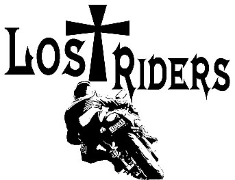 | ||
Jerseyguy |
Glitch - I Like that! (If you read my subsequent posts you'll see that's it's not a logo but for a shirt). Ferris - Chill out bro... Grumpy - LOL - I won't order one for you. | ||
Glitch |
This is really for a t shirt and not a logo per se. A poor choice of words for me. That's what I get for skimming while trying to catch up from being gone for so long. Carry on  I think that minus the signs, that would make a great shirt. |