| Author |
Message |
    
Pkforbes87
| | Posted on Tuesday, March 23, 2010 - 12:37 am: | 


|
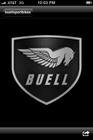
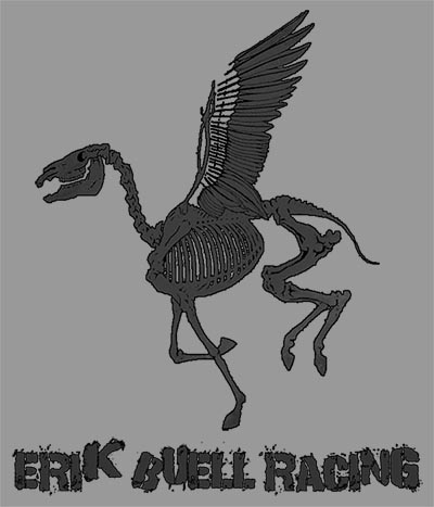
I like the EBR logo.
I'm also a fan of the final Buell emblem with the shield. The one from the BoB. The logos older than that never really appealed to me. Regardless, something like a logo wouldn't sway my decision in purchasing a motorcycle.
I've always wanted to put a couple of these on the tank of my molten orange / nuke blue X1:
 |
Rpm4x4
| | Posted on Tuesday, March 23, 2010 - 12:47 am: |
|
The new EBR logo is totally awesome IMHO. Best Buell logo to date. EBR really needs to start selling tshirts and stickers, with the new logo. Even better riding jackets, Id be all over that. |
Mr_grumpy
| | Posted on Tuesday, March 23, 2010 - 07:25 am: |
|
I'll take an EBR Frisbee, I can't play guitar. |
Buell920
| | Posted on Tuesday, March 23, 2010 - 12:31 pm: |
|
>>>HD should announce it's future plans
Never happen.
They couldn't fire Buell back up if their lives depended on it.
After ������� 200 great folks out of jobs . . . . it'd never happen.
um, did you look at the newer labor contract the UNION has with HD. it may happen, but as a family in the HD line up.
I'm only speculating, no insight, just pure speculation. |
Buell2001b
| | Posted on Tuesday, March 23, 2010 - 01:56 pm: |
|
i think it looks great.
I also think that EBR should stick with white and black bikes and make that their color.
just like RED is Ducati.
the black EBR with the silver fuell frame and other parts is very elegant and classy.
nothign a red neck would ever ride. |
Buell920
| | Posted on Tuesday, March 23, 2010 - 01:59 pm: |
|
I think he needs to ditch all the colors on the new bikes, ie, make it all clear bodywork. I would love to have an all clear air box, fly screen, front fender and tail section. I know it would fog quick but a little buffing an it back to new.
(Message edited by buell920 on March 23, 2010)
(Message edited by buell920 on March 23, 2010) |
Firebolt020283
| | Posted on Tuesday, March 23, 2010 - 02:00 pm: |
|
I agree that Black should be the official buell racing color.
Also I really like the new EBR logo I think it looks really aggressive, but I also liked the shield logo as well |
Buell2001b
| | Posted on Tuesday, March 23, 2010 - 02:25 pm: |
|
yes the shield on a logo is a very strong statement. it showa strenght. Ducati has a shield on one of their logos.
I can see EBR developing one too.
and it should be with a depth and in the front faing in the middle so anyone walking can recognize the symbol of great engineering. |
Rex
| | Posted on Tuesday, March 23, 2010 - 02:53 pm: |
|
|
Swordsman
| | Posted on Tuesday, March 23, 2010 - 04:50 pm: |
|
The shield logo was cool. Still pissed they never sent me my free sticker even though I filled out the online form well ahead of the demise.
My own take. Not as aggressive, but a little "cleaner" than the current EBR logo, I think. Could still use some fine tuning on the angles, but it's just a sketch after all. Again, just my own personal taste.

~SM |
Court
| | Posted on Tuesday, March 23, 2010 - 06:23 pm: |
|
>>>>The shield logo was cool.
It should be considering what they paid for it.

Don't even try to guess, your hearts not strong enough. |
2kx1
| | Posted on Tuesday, March 23, 2010 - 07:35 pm: |
|
$150 |
Johntman
| | Posted on Tuesday, March 23, 2010 - 08:21 pm: |
|
swordsman, backwards E and a B for the wings.. very nice... but it's lacking that movement, motion, aggressive forward motion of the current one |
Greg_e
| | Posted on Tuesday, March 23, 2010 - 09:38 pm: |
|
It needs to be aggressive and evil looking, like if you cross it, it will come back and tear your lips off! |
Two_buells
| | Posted on Tuesday, March 23, 2010 - 09:47 pm: |
|
more logos here
http://www.badweatherbikers.com/cgibin/discus/show .cgi?142838/538498 |
Bobbuell1961
| | Posted on Tuesday, March 23, 2010 - 10:01 pm: |
|
Cliff, would you like a BOB with the sticker?
PM me, i like yours, although i think a little fire underneath would look good like the pheonix |
Mr_grumpy
| | Posted on Wednesday, March 24, 2010 - 07:17 am: |
|
Swordsman, my first thought was that it's got it's arms crossed giving out "That Look" that wives give you. |
Vampress
| | Posted on Wednesday, March 24, 2010 - 07:51 am: |
|
I like the logo, but imho there are two small faults with it.
I think the text and logo picture look too separate. If you work the text 'into' a design, then they can never be separated.
For example if you got a decal of the current design, you could simply cut the name off the bottom and use the design only. Good for us, bad for company that wants their name on everything.
Secondly, just a glance makes it look unbalanced (to me). The pegasus leans too far forward as if front heavy and going down.
The back end is light and lifts, which is compensated by the darker bold text beneath. This text compensation however, then separates the company name, effectively making it read "ERIK BUELL racing".
Just thoughts. |
Gohot
| | Posted on Wednesday, March 24, 2010 - 07:56 am: |
|
Guys....guys, get off the computer, go out start up the bike and go ride.........your brains are melting here.....trust me.... |
Mr_grumpy
| | Posted on Wednesday, March 24, 2010 - 08:55 am: |
|
Gohot, trust me I wish I could, I'm sandwiched between the Jura mountains & the Alps babysitting my 10 year old while his mum's away on a course in Paris.
It's a beautiful sunny spring day here no tourists about & my bike's 500 miles away at home. Grrrr  |
Swordsman
| | Posted on Wednesday, March 24, 2010 - 10:11 am: |
|
Can you tell I have nothing better to do?

~SM |
Firebolt32
| | Posted on Wednesday, March 24, 2010 - 10:22 am: |
|
Pk...it needs to look more like this. That one you have is no good.

|
Mikej
| | Posted on Wednesday, March 24, 2010 - 10:27 am: |
|
My first reaction to the first image in this thread is that it looks like a horse head skull. After that the body is too small for the head, maybe it's skeletonized (symbolic imagery???). Finally the text is too vertically compressed and just becomes a muddy underline beneath the image.
Sorry if that sounds too negative but those are my gut reactions from seeing it. I'll go back to my cave now, have a nice day.
 |
Glitch
| | Posted on Wednesday, March 24, 2010 - 11:14 am: |
|
My first reaction to the first image in this thread is that it looks like a horse head skull
I had to...
|
Mr_grumpy
| | Posted on Wednesday, March 24, 2010 - 01:21 pm: |
|
All hail Glitch, the king of photoshop.
We're not worthy O master.
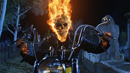
PS(Can we have the grim reaper riding it?) |
Buell2001b
| | Posted on Wednesday, March 24, 2010 - 04:23 pm: |
|
lol, you goofballs |
Glitch
| | Posted on Wednesday, March 24, 2010 - 05:52 pm: |
|
Can we have the grim reaper riding it?
The grim reaper rides a harley. |
Spdrxb
| | Posted on Wednesday, March 24, 2010 - 09:27 pm: |
|
I always thought this guy is way more cool than the reaper. Sorry totally of thread subject
|
Spdrxb
| | Posted on Wednesday, March 24, 2010 - 09:30 pm: |
|
there this is better
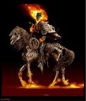
BTW I like the new EBR logo
(Message edited by spdrxb on March 24, 2010) |
Blake
| | Posted on Thursday, March 25, 2010 - 02:02 pm: |
|
"I also think that EBR should stick with white and black bikes and make that their color just like RED is Ducati.
The black EBR with the silver fuel frame and other parts is very elegant and classy."
+1000
I also agree that the shield logo is killer.
Greg,
Not "evil looking", evil is not good; I'd say "fierce" looking. |
Buell2001b
| | Posted on Thursday, March 25, 2010 - 02:15 pm: |
|
you know what funny is who would be scared of that flamed skeleton on a Harley.
I mena come on, who the heck is he going to be able to cath on that slow ass bike.
now if it was a Buell I would think twice not to mes with him,lol |