G oog le BadWeB | Login/out | Topics | Search | Custodians | Register | Edit Profile

Buell Forum » Storm Fronts: Buell Groups, Clubs, & Events » 070 DC-VA-MD Buell Riders » CABO General Info » !! Let's Play The Name Game !! » Archive through January 11, 2008 « Previous Next »

Author Message
Top of pagePrevious messageNext messageBottom of page Link to this message

Deltablue
Posted on Tuesday, November 27, 2007 - 09:53 am:   Edit Post Delete Post View Post/Check IP Print Post    Move Post (Custodian/Admin Only) Ban Poster IP (Custodian/Admin only)

I like CABO but .... Chesapeake Area Buell Owners.
Top of pagePrevious messageNext messageBottom of page Link to this message

Xb12mel
Posted on Tuesday, November 27, 2007 - 10:01 am:   Edit Post Delete Post View Post/Check IP Print Post    Move Post (Custodian/Admin Only) Ban Poster IP (Custodian/Admin only)

Pssst... what every ya'll decide to call it, don't forget to register on the Buell Site!

Not that I mind telling folks, just go to Buell.com, we're the only group in VA listed...
Top of pagePrevious messageNext messageBottom of page Link to this message

Babired
Posted on Tuesday, November 27, 2007 - 10:40 am:   Edit Post Delete Post View Post/Check IP Print Post    Move Post (Custodian/Admin Only) Ban Poster IP (Custodian/Admin only)

CABO Chesapeake area Buell Owners is my vote K
Top of pagePrevious messageNext messageBottom of page Link to this message

Stevedplumber
Posted on Tuesday, November 27, 2007 - 11:59 am:   Edit Post Delete Post View Post/Check IP Print Post    Move Post (Custodian/Admin Only) Ban Poster IP (Custodian/Admin only)

+1 on the Chesapeake Area Buell Owners
Top of pagePrevious messageNext messageBottom of page Link to this message

Blublak
Posted on Wednesday, November 28, 2007 - 10:01 am:   Edit Post Delete Post View Post/Check IP Print Post    Move Post (Custodian/Admin Only) Ban Poster IP (Custodian/Admin only)

Hey Bear, I like that patch as well.. But, as someone stated, calling ourselves 'kittens' may not give the right mental image of us. So it didn't make the final cut. Maybe one of the more artistic (I'm only good with a camera sorry) could try drawing up something for us.. perhaps incorporating the 191st logo in some manner into one for our local 'club'.

As for Chesapeake.. I don't see a problem with that.. heck, we can be both! Same acronym, same club, just different uh, divisions of it.. It's a thought..

As for the polls.. voting still closes the first of December and I'll announce the winner.. Then, I'm sure Blake will be happy to give us our header (which brings up the 'logo' thing again) and I'll notify Buell dot com of 'the club'..

Thanks again to all those that have voted. Those of you that haven't.. better hurry it up!
Top of pagePrevious messageNext messageBottom of page Link to this message

Toona
Posted on Saturday, December 01, 2007 - 07:36 pm:   Edit Post Delete Post View Post/Check IP Print Post    Move Post (Custodian/Admin Only) Ban Poster IP (Custodian/Admin only)

hehehe, CABO. Just had to do it to ya....
Top of pagePrevious messageNext messageBottom of page Link to this message

Blublak
Posted on Sunday, December 02, 2007 - 03:43 pm:   Edit Post Delete Post View Post/Check IP Print Post    Move Post (Custodian/Admin Only) Ban Poster IP (Custodian/Admin only)

Well fellow Buellers...

It's a done deal now.. The polls closed, the votes from all sources counted, tallied and verified to have no hanging chads or other traditional signs of muck puckery..

I suppose it's time for us all to welcome into official life...


CABO

The - Capital/Chesapeake Area Buell Owners are on the BadWeb.. See democracy in action..
Top of pagePrevious messageNext messageBottom of page Link to this message

José_quiñones
Posted on Monday, December 03, 2007 - 07:26 pm:   Edit Post Delete Post View Post/Check IP Print Post    Move Post (Custodian/Admin Only) Ban Poster IP (Custodian/Admin only)

can we use Buell in the name?
Top of pagePrevious messageNext messageBottom of page Link to this message

Blublak
Posted on Monday, December 03, 2007 - 08:36 pm:   Edit Post Delete Post View Post/Check IP Print Post    Move Post (Custodian/Admin Only) Ban Poster IP (Custodian/Admin only)

Uh.. Yes. Because we said so.

There, that was easy..

Long version, Are we or are we not owners of Buells? Show me where there is anything actionable? We're not like .. say, uh, HOG, we're not trying to make money on the name.. We're not charging dues... So there!

There I said it.. I own a Buell and I'm proud of it!

Now on to important stuff..

WHO's GOT A LOGO FOR US?
Top of pagePrevious messageNext messageBottom of page Link to this message

Rasmonis
Posted on Tuesday, December 04, 2007 - 08:11 pm:   Edit Post Delete Post View Post/Check IP Print Post    Move Post (Custodian/Admin Only) Ban Poster IP (Custodian/Admin only)

I'll add our group on the Buell site.
Top of pagePrevious messageNext messageBottom of page Link to this message

Rasmonis
Posted on Tuesday, December 04, 2007 - 08:18 pm:   Edit Post Delete Post View Post/Check IP Print Post    Move Post (Custodian/Admin Only) Ban Poster IP (Custodian/Admin only)

Done, waiting for approval. Pete thanks taking care of the club name.

C.A.B.O. will be listed under Washington DC. I used my contact information for now.
Top of pagePrevious messageNext messageBottom of page Link to this message

Blublak
Posted on Wednesday, December 05, 2007 - 08:01 am:   Edit Post Delete Post View Post/Check IP Print Post    Move Post (Custodian/Admin Only) Ban Poster IP (Custodian/Admin only)

Ramon, you and everyone else that participated.. Your welcome.. and thank you for participating.. after all that's what we need to be about.. Participation.


Hmmm...

On the Buell website.. Could we also add C.A.B.O to Virginia and Maryland? Would Buell allow that? I mean, we are the group for NoVA and for A majority (if not all) of Maryland.. Just a thought..


Now, about a logo.. something catchy, something graphic.. something.. oh I don't know.. who can draw? Someone must have an idea somewhere... If you want a photographic logo.. let me know, I'll do the photo work.. I'm just not much of graphic artist type..
Top of pagePrevious messageNext messageBottom of page Link to this message

Rasmonis
Posted on Thursday, December 06, 2007 - 08:17 pm:   Edit Post Delete Post View Post/Check IP Print Post    Move Post (Custodian/Admin Only) Ban Poster IP (Custodian/Admin only)

Listing on the Buell website allows only one state per group.
Top of pagePrevious messageNext messageBottom of page Link to this message

Blublak
Posted on Friday, December 07, 2007 - 03:54 pm:   Edit Post Delete Post View Post/Check IP Print Post    Move Post (Custodian/Admin Only) Ban Poster IP (Custodian/Admin only)

Oh well.. I guess it'll have to do.. for now..
Top of pagePrevious messageNext messageBottom of page Link to this message

Pellis
Posted on Sunday, December 09, 2007 - 03:50 pm:   Edit Post Delete Post View Post/Check IP Print Post    Move Post (Custodian/Admin Only) Ban Poster IP (Custodian/Admin only)

Here's something I worked on a while ago.
It's a ripoff of the C3-Carolina Corner Carvers and the Aerostich Tours logos.
They still need to be cleaned up.


capatol1


capatol2


monument1


monument2


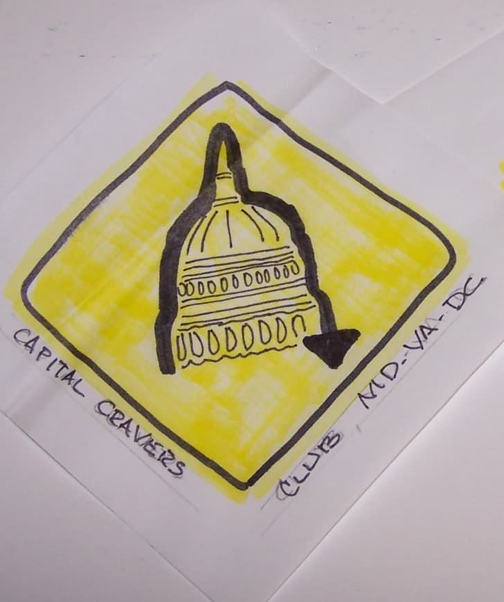
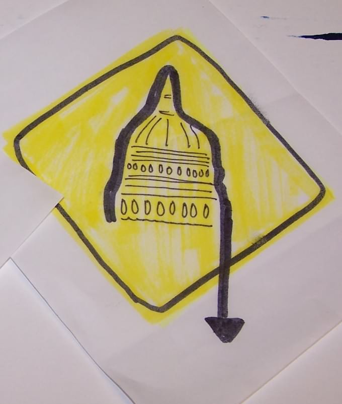
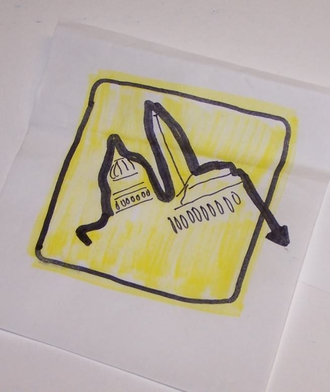
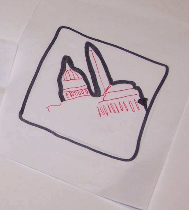
(Message edited by pellis on December 09, 2007)

(Message edited by pellis on December 09, 2007)
Top of pagePrevious messageNext messageBottom of page Link to this message

Blublak
Posted on Sunday, December 09, 2007 - 08:37 pm:   Edit Post Delete Post View Post/Check IP Print Post    Move Post (Custodian/Admin Only) Ban Poster IP (Custodian/Admin only)

Hmmmm... I can see some potential in them ... But I'm sure we can be a little more 'original' or at least we can make something that's .. well, what'cha wanna call it? Something that belongs to us.

Yeah, I see some real potential there Pellis..
Top of pagePrevious messageNext messageBottom of page Link to this message

Buell2001b
Posted on Wednesday, December 12, 2007 - 01:40 pm:   Edit Post Delete Post View Post/Check IP Print Post    Move Post (Custodian/Admin Only) Ban Poster IP (Custodian/Admin only)

should the logo resembe a bike in some way so people now its a bike club and not a highway sign group
Top of pagePrevious messageNext messageBottom of page Link to this message

Rasmonis
Posted on Monday, January 07, 2008 - 10:20 am:   Edit Post Delete Post View Post/Check IP Print Post    Move Post (Custodian/Admin Only) Ban Poster IP (Custodian/Admin only)

Here's my second stab at it, I changed the colors to match an Old Bay can (Chesapeake Bay reference),

The knee down rider for our passion for sport riding, wings to represent Buell (Pegasus), the star represents our 5 regions (dealerships & the District). Used "Impact" for the font(BUELL font). Not sure if something else might work better. If any of you have a cool font we can use let me know. The bike BTW is an 1125R.


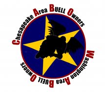
The most recent version of this logo has the rider centered, the star is outlined in black and upright instead of slightly canted to the left.

Comments/remarks and suggestions welcome.
Top of pagePrevious messageNext messageBottom of page Link to this message

Babired
Posted on Monday, January 07, 2008 - 10:53 am:   Edit Post Delete Post View Post/Check IP Print Post    Move Post (Custodian/Admin Only) Ban Poster IP (Custodian/Admin only)

Ras cool logo! K
Top of pagePrevious messageNext messageBottom of page Link to this message

Rasmonis
Posted on Monday, January 07, 2008 - 07:35 pm:   Edit Post Delete Post View Post/Check IP Print Post    Move Post (Custodian/Admin Only) Ban Poster IP (Custodian/Admin only)

Ok, here's the latest version:
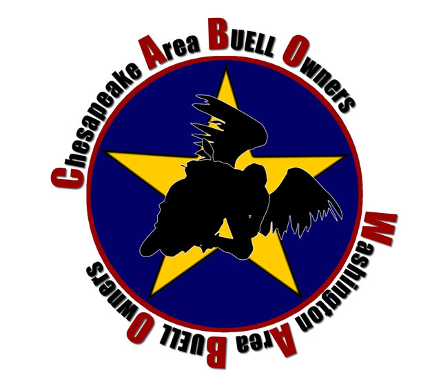


Top of pagePrevious messageNext messageBottom of page Link to this message

Rasmonis
Posted on Monday, January 07, 2008 - 09:47 pm:   Edit Post Delete Post View Post/Check IP Print Post    Move Post (Custodian/Admin Only) Ban Poster IP (Custodian/Admin only)

Slightly modded version:


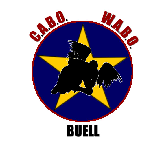
Not sure what to do with the text or how to add Buell to it. Suggestions welcome.

If anyone wants to edit it, I have a layered PNG version and can also convert it to PSD.
Top of pagePrevious messageNext messageBottom of page Link to this message

Toona
Posted on Monday, January 07, 2008 - 11:14 pm:   Edit Post Delete Post View Post/Check IP Print Post    Move Post (Custodian/Admin Only) Ban Poster IP (Custodian/Admin only)

Ras, I like the "level" star, instead of the canted one.
Maybe start the Chesapeake at "9:00" and Washington at "3:00" I like it spelled out better than abbreviated
Sorry, but I don't really care for the "bat wings" on/behind the bike. If you remove the wings, you'll have to "slide" the bike to the center of the star.
Maybe for ease of decals/embroidery etc change the burgundy to blue. That would make it a 3 color logo instead of 4. I like the first letter of each word the accent color.
Top of pagePrevious messageNext messageBottom of page Link to this message

Smiley1eye
Posted on Wednesday, January 09, 2008 - 07:34 pm:   Edit Post Delete Post View Post/Check IP Print Post    Move Post (Custodian/Admin Only) Ban Poster IP (Custodian/Admin only)

anyone worried about how closely it resembles Cabo Wabo, the bar in Cabo San Lucas Mexico? You know i won a drinking contest there way back in the early 90s...
i dont have any official input here, im just in the area and was looking to get involved with a group and you guys are my 'assigned region'. good luck with the logo.
Top of pagePrevious messageNext messageBottom of page Link to this message

Rasmonis
Posted on Wednesday, January 09, 2008 - 08:53 pm:   Edit Post Delete Post View Post/Check IP Print Post    Move Post (Custodian/Admin Only) Ban Poster IP (Custodian/Admin only)

A few more versions for your viewing pleasure or not.
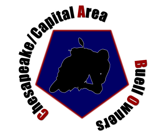
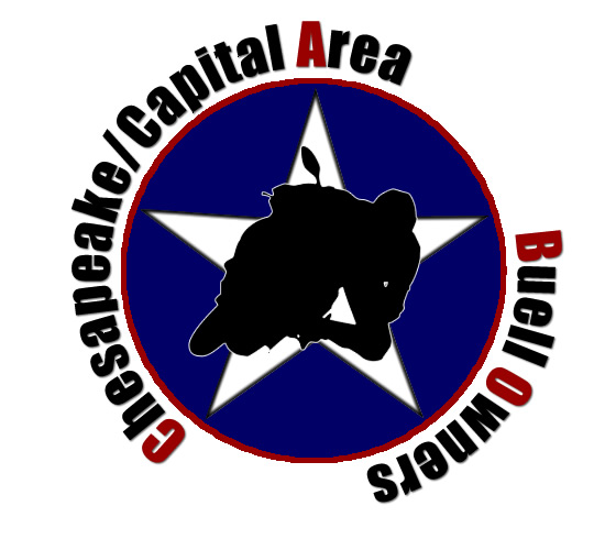
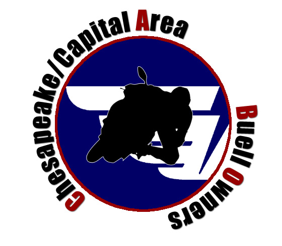


Top of pagePrevious messageNext messageBottom of page Link to this message

Toona
Posted on Wednesday, January 09, 2008 - 10:19 pm:   Edit Post Delete Post View Post/Check IP Print Post    Move Post (Custodian/Admin Only) Ban Poster IP (Custodian/Admin only)

I played with it a little.


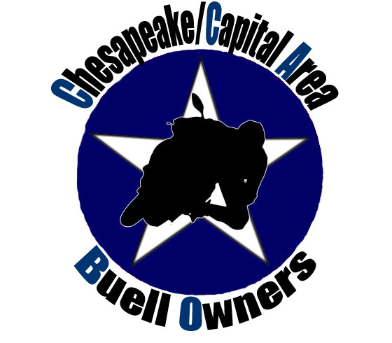
I changed the burgundy to blue in the lettering, removed the burgundy ring around the star and "squared up" (not sure how else to describe it) the title circle. I tried to also add a black ring around the blue circle, but didn't have much luck with my limited PS ability.

I went with just blue, black and white to make it a 2 color logo on a white background. Every extra color adds to the cost of printed t's, embroidery etc.
Top of pagePrevious messageNext messageBottom of page Link to this message

Blublak
Posted on Thursday, January 10, 2008 - 10:10 am:   Edit Post Delete Post View Post/Check IP Print Post    Move Post (Custodian/Admin Only) Ban Poster IP (Custodian/Admin only)

Hey Smiley! Welcome aboard! (so to speak)

Yeah, the WABO part originally was an idea for something else. I think we're going to drop it to try and keep it a little simpler to remember. Stay tuned as we work on little things.. Like getting ourselves 'introduced' to the area dealers and hopefully setting up a thing or two for us to do as a uh.. gang? err.. group.. yeah, that's right..

Ramon, Toona, I think we're getting closer! I had given another idea via PM and we're going to see if it's viable before we display it to see what folks think. Hmmm.. One niggling thing, should Capital come first in Capital/Chesapeake?

One idea that won't work for patches or tees would be to use a large capital 'C' and then have the rest of the words spelled from them One word along the top, one along the bottom.. But I think that would require the letters to be too small to embroider (for a patch) or to read very easily.

Oh and remember, for patch ideas.. NO 3 PATCH DESIGNS.. We're not that kind of group and there's no need to draw the hassles on the road.
Top of pagePrevious messageNext messageBottom of page Link to this message

Rasmonis
Posted on Thursday, January 10, 2008 - 05:02 pm:   Edit Post Delete Post View Post/Check IP Print Post    Move Post (Custodian/Admin Only) Ban Poster IP (Custodian/Admin only)

Ok , here's the 2 color version:
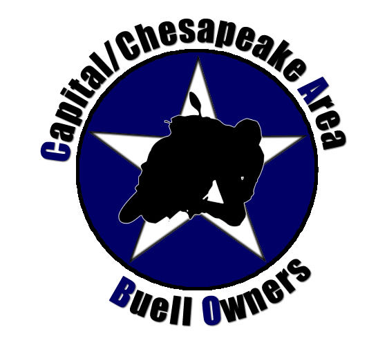


Top of pagePrevious messageNext messageBottom of page Link to this message

José_quiñones
Posted on Thursday, January 10, 2008 - 07:08 pm:   Edit Post Delete Post View Post/Check IP Print Post    Move Post (Custodian/Admin Only) Ban Poster IP (Custodian/Admin only)

Looks good, I still like Paul's both are good.

How about three stars like DC uses instead of one?

One each for MD, VA and DC


One white star on a blue background, like that free Buell "own the corners" hat could be confused with the cowgirls symbol....
Top of pagePrevious messageNext messageBottom of page Link to this message

Rasmonis
Posted on Friday, January 11, 2008 - 12:57 pm:   Edit Post Delete Post View Post/Check IP Print Post    Move Post (Custodian/Admin Only) Ban Poster IP (Custodian/Admin only)

Jose,

I like that idea, let me see what I can do.
Top of pagePrevious messageNext messageBottom of page Link to this message

Rasmonis
Posted on Friday, January 11, 2008 - 08:30 pm:   Edit Post Delete Post View Post/Check IP Print Post    Move Post (Custodian/Admin Only) Ban Poster IP (Custodian/Admin only)

Ok, here it is with a variant of the DC logo in white:
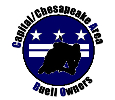


« Previous Next »

Topics | Last Day | Tree View | Search | User List | Help/Instructions | Rules | Program Credits Administration