| Author | Message | ||
Icon12r |
I'm in the process of designing the cover for my album coming out early December. I've talked to quite a few people, and have it narrowed down to two. The music style is softer, very melodic, rock. So here it is, I'm leaving this up to my BadWeB brothers... A. 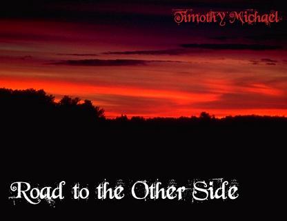 or 2. 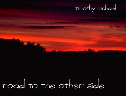 | ||
Diablobrian |
I like the first one. | ||
Rotzaruck |
I like the top of the first one and the bottom of the second one. I'm no help at all. Well, I guess I like the top of the first one more than the bottom of the second one, so I'll compromise and vote for the first one too. | ||
Dnchevyman |
first one for sure | ||
Icon12r |
It can always be changed, if someone should happen to bust out the ol' photoshop... I'm always open to ideas. | ||
Ulywife |
I like the second one! | ||
Dbird29 |
#2 for sure. #1 looks like it might be church music or something.  | ||
Ft_bstrd |
The fonts on the first one looks like a cross between DEO and Ozzy. The cover to me looks like the earth burning or the ninth circle. Needs a Meatloaf demon motorcycle thing. The title kinda cinches the impression. The second one just looks like a sunset. | ||
Loki |
#2 With the chosen art work it just looks cleaner | ||
Iamike |
Ditto #2. Any Youtube links for samples? | ||
Glitch |
 Which side? Just kidding.  I like the first one best. | ||
Spiderman |
it needs more devils, gun, guitars and naked ladies on motorcycles!  Just kiddin, first one. | ||
Nevrenuf |
would you down size the letters glitch | ||
Mikej |
The first one might be okay for me if the letters had less "noise" to them. The second one would look better to me if the upper name was just a bit bolder, looks like portions of the letters are fading/blending out. Is this your music? | ||
Etennuly |
Where is the silhouette of the Buell riding in the sunset? | ||
Loucksgl |
First one without a doubt | ||
Sleez |
A. (a "mad about you" fan i see?) (Message edited by sleez on October 15, 2007) | ||
Rde48 |
1 I like 1 but a sample of the music may be needed to make a good choice. | ||
Icon12r |
Mike, Yeah it's my music... I will have 2 "samples" posted within the next week. I personally thought 1 looked the best. Granted the font doesn't exactly go with the music style, it fits well with the lyrics of the title track. My main worry was people will look at the cover, and think the style is more... grunge? It seems to lose the acoustic feel of the music. | ||
Badlionsfan |
for some reason #2 brings kenny g (the one note wonder) to mind. | ||
Mikef5000 |
#2 looks more appropriate for softer music to me. | ||
Brinnutz |
Idea, What about the name in white in the 2nd pic's font, but the album name in the first pic's font in red. I think that would look pretty neat... |