| Author |
Message |
    
Mikej
| | Posted on Tuesday, March 05, 2002 - 08:16 am: | 


|
Blake,
If you have one of the newer BRAG keyfobs with the leaning bike on the right end, the "eyelet" dohickeythingy I'm talking about is on the left end. Hangs out in the breeze, doesn't get in the way of the graphics, and is easily clipped or broken off either deliberately or accidently.
I'd look up a picture and post it, but I'm running late for work, and the newbie-boss is back in town today, and is probably suffering from jetlag and he gets somewhat (uh, enter your own words here) when he's like that. Suffice it to say, I gotta go. 
ps: the "corner" of an oval is the tighter radius at the apex, where most people either skid off the track, or where they hit the gas too soon and begin their departure, either way the apex is sometimes the critical point IMHO. |
Rocketman
| | Posted on Tuesday, March 05, 2002 - 09:56 pm: |
|
Ah well, maybe I'm out voted but here I go.......
NONE OF THEM
Ok, maybe they look ok but come on, we're all voting on but a handful of hash-ups. Let's get it right instead of jumping now. The ovals are all to basic and I'm not into the idea of using the term BADWEB. That's about as unimaginative as it gets. Surely the word BUELL or at least an identifiable picture of one, and the words WWW.BADWEATHERBIKERS.COM must be included.
Let's take our time please and can we try something other than the Ford style oval.
Rocket in England |
Peter
| | Posted on Wednesday, March 06, 2002 - 02:53 am: |
|
Forget procrastination.
Go with the oval, and redesign it if a new, better idea comes along. Then the oval will be the original "classic" and naturally gain more status than the new improved model
PPiA |
Rocketman
| | Posted on Wednesday, March 06, 2002 - 08:09 pm: |
|
Ok I buy that Peter. Go with what we all want for now, and if something better comes along, change it.
All agreed ?
Rocket in England |
Jsunstar
| | Posted on Wednesday, March 06, 2002 - 11:03 pm: |
|
i like it...
sounds good
Jason h
da burgh |
Blake
| | Posted on Thursday, March 07, 2002 - 03:48 am: |
|
And no need to include the "www." either I'd think eh? Besides, it's an ellipse.  |
Anonymous
| | Posted on Friday, March 08, 2002 - 03:00 am: |
|
all the creative geniuses and experts in buelldom and we can't come up with a logo to please sir rocket? what's the world coming to? |
Hans
| | Posted on Friday, March 08, 2002 - 11:45 am: |
|
Its a dilemma: How to express BUELL without naming it. Same kind of problem how to tell a blindly born person what is the meaning of red.
What about a logo with the name Buell, but partly covered with a thunder cloud ? Just enough covered...
Hans. |
Blake
| | Posted on Friday, March 08, 2002 - 03:20 pm: |
|
Hans: I don't think we have a problem using " Buell on the logo; it just has to be used in a narrative of some sort, like Battle2Win does when they put "for the Buell motorcyclist enthusiast" on their main magazine title bar.
Is PaulinOZ lurking? Paul? You did such a cool, albeit outlaw, logo for SacBORG. Got anything up your sleeve for BadWeB? Something exibiting an American connotation would be fitting.
The guys didn't catch on to the contact patch logo (the one above the listing of logos). I thought y'all would like that. The asphalt doesn't translate to gif mode real well.
Y'all start throwing out brainstorming ideas, and qualities and attributes of Buell that appeal to you. I'll start...
Long stroke
Grunt
Torque
Simple
Lean
Competent
Low Maintenance
Strong
Growling
Crouching
Rumbling
Shaking
Neck Snapping
Lightning
Thunderbolt
Cyclone
Rough Hewn
Carving
Scraping
Diving
Athletic
Internet Group
Web Community
Court!, FB!, Anyone? |
Bluzm2
| | Posted on Friday, March 08, 2002 - 04:36 pm: |
|
Hey! Ya forgot naked! |
Hans
| | Posted on Friday, March 08, 2002 - 05:07 pm: |
|
Global
Centralised mass
Different
Powerful
Naked
Air cooled
Conceptual
Strong
Sturdy
Reliable
Brave
Economical
Smiling thunder
Buell owners
Independent owners of Buell motorbikes.
Global group of independent Buell owners.
International Independent Internet Buell enthusiasts. |
Travis
| | Posted on Friday, March 08, 2002 - 11:56 pm: |
|
Economical? |
Hans
| | Posted on Saturday, March 09, 2002 - 07:58 am: |
|
Yes: Economical, thrifty, frugal, sparing: 50 Miles/gallon, oil change: 2 quarts, plugs: only 2, oil filter: the original filter is the cheapest of all original brands for any motorcycle.
Parts needed after tipping over: Only one foot shifter pedal, price: Not worth to remember.
Insurance: Lowest category.
Chain and sprockets renewel: nihil.
Maybe 'economical' does not sound attractive?
Well then, another one: Exuberant
Hans |
Sybren
| | Posted on Saturday, March 09, 2002 - 04:19 pm: |
|
Buells have sex appeal, yeah baby yeah! |
Blake
| | Posted on Saturday, March 09, 2002 - 08:53 pm: |
|
... and maybe "Visceral"?
Okay... now narrow the list to ten of the best/favorite descriptors. |
Blake
| | Posted on Saturday, March 09, 2002 - 09:18 pm: |
|
MikeJ: I'm still not sure I'm with you on the eyelette thing. Are you talking something like?...
 |
Mikej
| | Posted on Sunday, March 10, 2002 - 01:22 pm: |
|
Blake,
Sort of. Move it about 120° counterclockwise so it hangs off the end out past the last "B". Thicken up the blue ellipse (or is that one an oval?????). Then put the "Buell" text on the field in microprint. If the legals object then it's a simple matter to either paper-punch out the Buell text and have an eyelet looking like a keyring fob, or the entire eyelet can just be clipped/carved off.
Look at the small Executive Swiss army knives and see how they do it. Anyway, it's just an idea to allow a quick-change compliance move. That way there will still be a few in circulation like some of the old Buell T-Shirts that the H-D corporate threw a coniption (sp?) fit over.
Gotta go,
MikeJ |
Anonymous
| | Posted on Sunday, March 10, 2002 - 10:34 pm: |
|
We have a winner!!

R |
Blake
| | Posted on Monday, March 11, 2002 - 01:15 am: |
|
Hey!!! Anon R is a talented sumbitch ain't he! I like it. LOL. |
Travis
| | Posted on Monday, March 11, 2002 - 12:44 pm: |
|
Jack-of-all-trades
I like it. I think it would look good on a shirt, yes? |
Blacksix
| | Posted on Monday, March 11, 2002 - 12:48 pm: |
|
That one looks good.
Back of T-shirt. |
Jim_Witt
| | Posted on Monday, March 11, 2002 - 05:32 pm: |
|
Anonymous wrote:
We have a winner!!
I agree!,
-JW:>) |
Hans
| | Posted on Monday, March 11, 2002 - 06:02 pm: |
|
Great. really great. Like it without the white insert even better:
 |
Anonymous
| | Posted on Monday, March 11, 2002 - 10:11 pm: |
|
More goofin' around
Started as a joke, seems to have legs now. If only Rocket would approve I could die happy. hehehe |
Oldman
| | Posted on Tuesday, March 12, 2002 - 07:10 pm: |
|
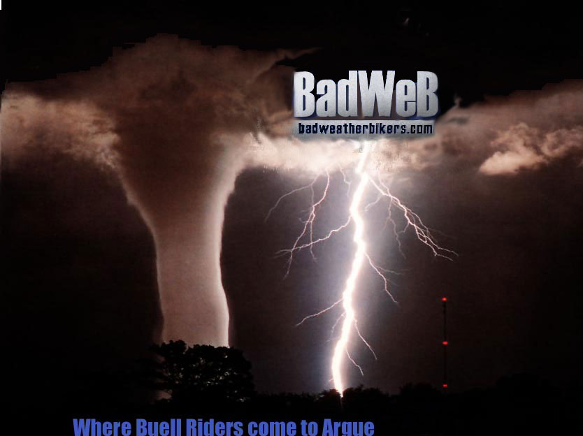
how about a firebolt doing a wheelie out of the storm with "this is the rebirth of the badweb, ride the web" |
Ccryder
| | Posted on Thursday, March 14, 2002 - 12:48 am: |
|
Go R!
Later all, time to dream of riding and running to beat the storm. Some day I'll need to relate my KS twister racing story, or how to push a 1975 Ducati at 120 to beat a severe t-storm (while riding double).
Neil S. |
Paulinoz
| | Posted on Thursday, March 14, 2002 - 01:33 am: |
|
Blake Above gets my vote
I dont think it needs to be US based a lot of us
here are OS not stateside.
I like the oval would work on a cap,patch or badge.
The overall picture would go well on the back of a t-shirt.
What about
"Dont argue with a Buell rider unless it's on Badweb" |
Rocketman
| | Posted on Friday, March 15, 2002 - 05:37 am: |
|
Ok let's talk ovals. They're pretty boring shapes unless what you put in them stands out. Buells best effort surely must be the yellow one and not any of the blue ones.
To see what can be done with an oval, without making it complicated, take a look at the BRAG oval. See how the curve comes off the oval ? It highlights the whole thing by appearing to add a whole new dimension.
Please, let's be a bit more creative.
Rocket in England |
Sweetdaddyd
| | Posted on Wednesday, April 03, 2002 - 11:55 am: |
|
Whatever is decided on, I can get it reproduced in vinyl decals, even in the brushed aluminum finish, carbon fiber, mirrored, or color changing vinyl. The weird stuff is more expensive and less easy to work with though. Price goes down with quantity but goes goes up with complexity (like using 2 colors and trying to weed out the small letters.) Or you can use the vinyl as a stencil for custom paint and it works well. I just did a reproduction of the race stripe package and it came out great. I altered the width of the stripes and made one thinner cause I thought it looked better. I'll have pics up soon in the for sale section.
Keith
sweetdaddydelicious@hotmail.com |
Newfie_Buell
| | Posted on Friday, April 05, 2002 - 09:36 pm: |
|
I vote for the above too for the back of a t-shirt with the oval logo of some kind for the front.
Lets come to some kind of an agreement so we can take it to the next level.
Bill |
|
 Logo for BadWeatherBikers.com? »
Archive through April 05, 2002
Logo for BadWeatherBikers.com? »
Archive through April 05, 2002